Kris is a successful novelist (under a different name) and he wanted to use his latest book as a way of trying out the self-publishing route. There’s a graphic novel version of hiddenfolk too but this version is aimed at the young adult market. The cover had to be clear enough to convey the elements of the book when scaled right down to a thumbnail.
This is what Kris said the novel was about: ‘The book has teen suicide, monsters (real and imagined) skateboards, American high school, old Nordic folklore, trolls, punk and metal.’
And here are the amazon keywords:
Coming of age, High school, Urban fantasy (genre), Contemporary fantasy (genre), Teenage, Troll, Bully, Suicide, Cyberbullying, Bullying, Facebook, Twitter, Skateboard, Metal, Doom metal, Punk, Love, Fighting, Folklore, Mythology
There’s quite a bit to go on there so my first designs were an attempt to pin it down a little more. By focusing on a different element for each attempt, I’d get more of an idea of the direction that Kris wanted to go in.
stage 1 – concept
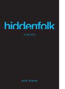 a) Less is more. This was my very first concept and not a particularly strong one. It used a simple typographic device as the main visual and colours that reflected the Facebook/Twitter element of the novel.
Feedback: Too corporate and subtle.
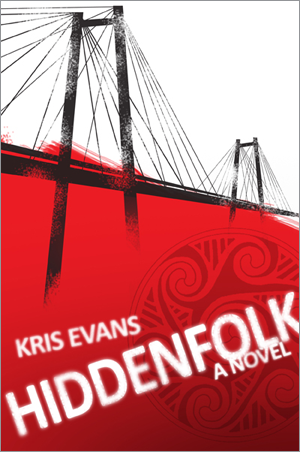
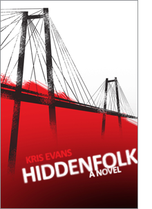 b) This takes a more rough and ready ‘skater’ approach and uses a visual cue from the opening of the book where the protagonist is standing on a suspension bridge, about to jump.
Feedback: Could go even further down this route.
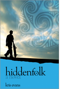 c) A more wistful concept because of some of the themes addressed in the book. I also thought the Nordic angle might be something worth exploring so I used the rune symbol that forms part of the artwork of the graphic novel version. It was only a few days later that I realised my subconscious must have taken a lot of inspiration from the cover of Birdsong…
Feedback: Wrong tone.
Kris asked me to work up b) a little more – perhaps trying to bring in something of the Nordic theme. Seeing the three different angles also gave him more of an idea of what he was looking for. He wanted the cover to be a ‘total punch in the face’ and sent me a few examples of some other things that he liked:

stage 2 – development
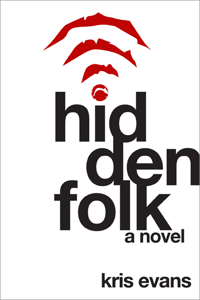
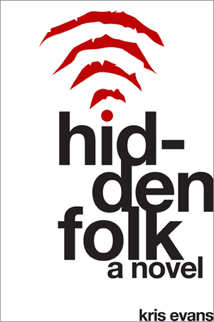
This is the reworked version of the earlier design, a little bit rougher and bringing in the rune symbol. Kris also sent me something else from the graphic novel – a wi-fi symbol made up of claw marks. This led to…
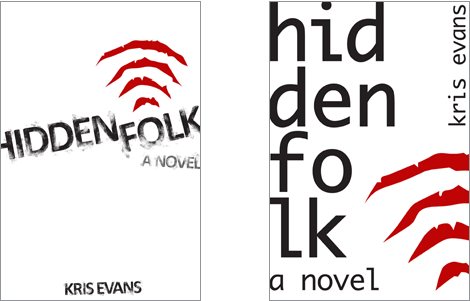
He really liked this one so I played around and tried a couple of other versions – one that used the text style from concept b) and one with an even more careless feel to the title.
stage 3 – final
We kept coming back to the first version with the wi-fi claw marks so, after a few final tweaks around the exact position of the text and a debate about the hyphen (which I lost) this is the final version that you can now find on amazon: