The first design is for an app: Painting Tales – a series of stories for children inspired by internationally renowned works of art. There’s a wonderful purity to designing apps. You’ve got to boil down a whole business into a simple square image that works when viewed at different sizes and has enough impact to stand out from the crowd.
The second is the logo for a business called Improved Printer Support. There wasn’t much of a brief for this apart from ‘I quite like blue’ so I thought it’d be a good project to demonstrate the stages of the design process – from initial concept through development and onto the final version.
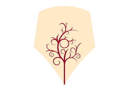
The third is for Understorey, a company that makes hand-crafted furniture. These are some of the logos I came up with during the concept phase. There’s quite a few different approaches here and I used them to help the client narrow down the direction he wanted to take.